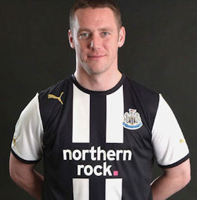
…Or how to mess up black and white stripes…
What do most people think of when they think of Newcastle United?
All joking aside, the famous black and white stripes would be high on the list. Players, managers, owners, and even fans come and go, but the stripes have been there since shortly after the East and West End clubs united in 1892 to set the footballing world alight (ok, well maybe not, but still…)
So what is Newcastle without our famous black and white stripes?
We will find out next season.
To describe the shirt, it is best to divide it into the two separate parts it actually is. The shirt has white sleeves and a black torso. So, in essence, it is a black shirt with white sleeves.
I can imagine the conversation at Puma HQ’s quality control room as they double-checked the final strip design before presenting to the club.
“Black: check. White: check.”
“Cracking. We got a winner here.”
“Oh, hang on boss. There was another checkbox on the other side of the page. We never seen it.”
“Fuck. Well, Tompkins, what is it?”
“Just says ‘stripes’ boss”.
“Shit me. It has to be ready to present in ten minutes. Does it say how many stripes?”
“No. Just ‘stripes’.”
“So more than one… Hmm… Tell you what Tompkins – pass me that Tipex, I got an idea.”
So, this design pays a half-hearted lip service to tradition with its two thin white stripes as a seeming afterthought, a (probable) late addition to the all-black (with white sleeves, naturally) strip that would have sold in the millions.
It’s not even like this was a strip from back in the club archives, as was the case when Arsenal dumped their traditional colours for the famous ‘redcurrant’ strip. We have never played in anything similar.
To me, Newcastle home kits were usually always cool. There was just something unendingly trendy about simple black and white stripes. There have been some canny away kits, and some shite ones, but the home kit is Newcastle United. That is how people see Newcastle. The memories of the Solero, or the hideous Asics green and blue away kit don’t last long outside of the area.
The only plus side with this design is that there will be a new one the season after that (unless you have kids to buy kits for. But still. Howay man. It’s shite).
The two home Puma efforts haven’t been brilliant, and are some climb down in style from even some of the less good Adidas kits. It’s almost like they’ve been made on the cheap with their stick-on badges, which is ironic as the price for one is now £50.
Shirts with properly stitched-on badges are only available to Toon Army 12th Man members, but even then that is not the proper badge, but a gold version. Why? Did we win something? Why the hell gold? What happened to a proper badge?
Squint at the picture again.
Look at Kevin Nolan, standing proud, hiding his embarrassment behind a sly grin. He looks like a waiter in a fancy restaurant. Black tie and waistcoat, white shirt.
Red strips seemingly strike fear into opponents, causing an increase in the heart rate. Yellow is easily seen out of the corner of the eye. Each strip has its own theory behind it. Newcastle’s new strip give an illusion of class, while ultimately taking your money in return for something unexpected and unwanted.
Sound like the Ashley administration?


6 Responses to In With the New?